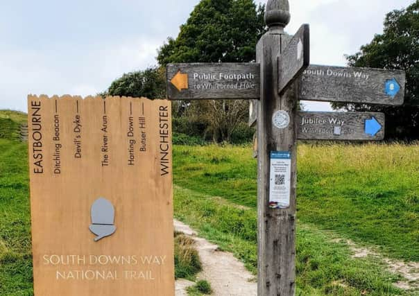
Uproar over new wooden sign for South Downs Way


Two readers even described the sign, installed to replace an old one marking the Eastbourne end of the iconic footpath the South Downs Way, as looking like a tombstone.
Jane Harris, of Cliff Road, said, “I was under the impression that a signpost is designed to aid visitors on their journey.
Advertisement
Hide AdAdvertisement
Hide Ad“Unfortunately the new sign does not fulfil this remit as it does not give any hint of the direction to the places listed on the sign, so what is the point?”
While Barbara Selby, of Victoria Road, said one would have to do a cartwheel to read where the sign points to. She said, “It looks more like part of a wall, and just not inviting or for that matter, a particularly helpful piece of artwork.
“Granted, the post already there is worn by the weather, and has seen better days, but the design is excellent in every way, and perfectly clear in directions.
“It just needed an exact copy made, painted brown, and lacquered.”
Advertisement
Hide AdAdvertisement
Hide AdSheila Palmer wanted to know how much money had been spent on what she called the ‘unnecessary and unwanted’ wooden plaque.
“It looks like a giant tombstone, does not provide any information and direction for the visitors to the area and is completely unsuitable for the beautiful surroundings,” she said, “It is pointless and does not serve any purpose whatsoever.”
Rodney Hyams added, “As a competitor in the Beachy Head marathon on October 27, I will be confronted and obstructed at the start by the new tombstone-like signpost at the foot of the downs.
“I believe it to be intrusive, inappropriate and totally unnecessary. Please keep the traditional signpost, as it is more in-fitting with the surroundings.”
Advertisement
Hide AdAdvertisement
Hide AdResident Laura Riley added her thoughts, “I think it looks hideous, I much prefer the older sign. If it aint broke?”
She went on, “Eastbourne is an Victorian seaside town, why the hurry to change it, make it modern?”
The Herald approached the South Downs National Park Authority for a response to these concerns but had not received a reply at the time of going to press.